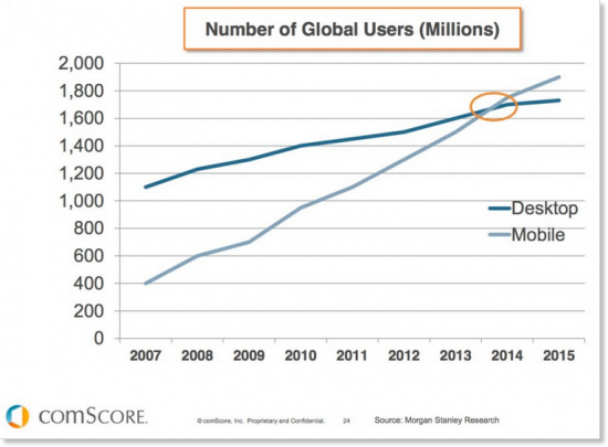
On April 21st 2015, the competitive landscape quietly shook for millions of small businesses. The change is the reaction to a tipping point in human behavior. And from this day on, if your website is not mobile-optimized, you will be effectively hidden from the majority of those who would look.

Source: http://www.smartinsights.com
The eventual tipping point has been obvious for a few years, which is an eternity in internet time. A technology was developed to fix the problem. Responsive design is now the standard in website development. Responsive design is dynamic rather than static; it adapts its structure based upon the size of the screen it’s on. For a demonstration, just re-size this page!
Fear of loss is a good reason to act, but there’s a better one. The fact that we now find you through our smartphones affords you an incredible opportunity. If you can make it easier for us to digest your message and reach you through our mobile devices, your veterinary clinic is very likely to win our business (in growing numbers).
Mobile-first design is the future. The incentives and behavior trends are just too far stacked in its favor for it not to be. And as our actions increasingly move online, its importance becomes truly immense.


What an interesting concept! Thank you for sharing 🙂